The art style that you always see but don’t process
More stories from Lucas Thompson
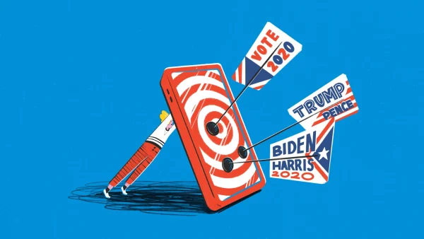
An example of the “Corporate Memphis” art style from Google Sites
You see it everywhere without even realizing it, but it only came to my mind looking at a photo credit for a school project.
The style is called “Corporate Memphis,” also known as the “big tech art style.” It’s often geometric, flat, and has abstract designs. Companies will create a character with a small head and a long body, and colors will always be universal.
The eeriest thing about Corporate Memphis is that the characters in this art form rarely have eyes, sometimes even no face. This style became famous from a design firm called Buck, developed in 2017.
Most corporations will use this art style since it can’t be offensive and is very simple to implement onto their websites. It tries to express joy so the consumers will relate that company with light-hearted thoughts.
But there is something about this style used by corporations that seem fake, and the characters almost feel evil through their vague, design-lacking art.
Look up any website, and there is a high chance these funky-looking figures appear. Even many of our articles on The Central Trend will have these in the thumbnails of our posts.
There is no stop for the Big Tech art style on this path now, but there are people who dislike the art style—it may be a roadblock for corporations.
I understand why companies would choose this option over paying more for a model of sorts. We don’t think twice when we first see this type of art. Even on our fifth visit, nothing pops out. The most fascinating part is just realizing how many times we have seen it without knowing.
But how long will this be a regular thing?
There is no stop for the Big Tech art style on this path now, but there are people who dislike the art style, and that may be a roadblock for corporations.
According to Explainmate.com, people don’t like how they can’t relate to the goofy characters. Another issue is that the art will try to design characters that aren’t standard body types so that no backlash is received, leading to weird, uncomfortable-looking characters.
One company may see competitors using this style, realize the popularity and unoriginality of it, and choose to find something else. Corporations try to go for minimalism with this art, but people claim it looks childish. Some adults even find themselves offended, assuming the companies see them as nothing more than kids.
The most bizarre complaint is about the style being “obnoxiously joyful.” People are insulted that it illustrates a perfect world with no issues.
While I can see why companies want to be inclusive of everyone so that it looks suitable for the brand, people say this takes it to an uncomfortable level. These static, illustrated characters have caused displeasure for so many, yet no one seems to be talking about it.
The next website you visit, even The Central Trend, try to pick out how often you come across these geometric and wacky colored figures. Their history is something I would never have thought about if not for looking closer into it. Are these pictures fake, or are these pictures showing how the company would genuinely like to succeed? Decide for yourself.


